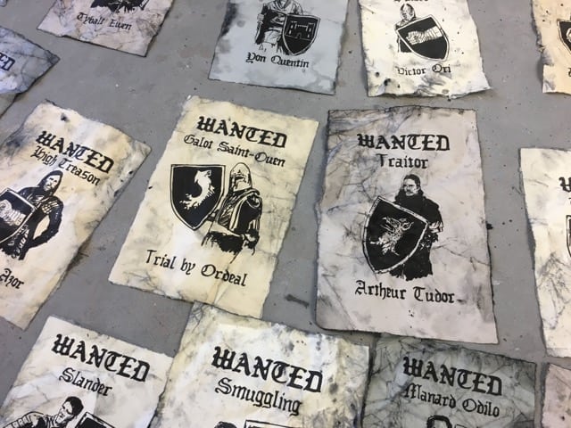
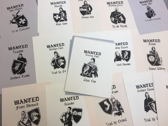
As we build our new medieval themed escape room at The Escape Effect, I have been making a wide variety of props and set pieces. This week I have been working on some wanted posters which are part of a puzzle in this game.
First off, I did some research on medieval crime and punishment to figure out what my characters might have been accused of in the Middle Ages and some background on the trades of that time. I found some great resources online (can’t say I remember my history from school) and did some brainstorming, which led to some gruesome discoveries!
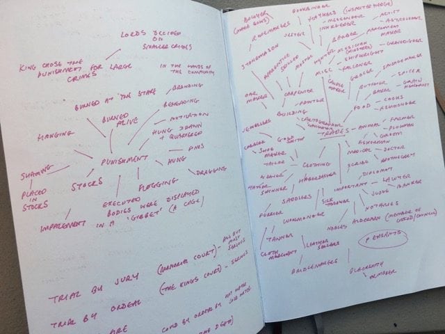
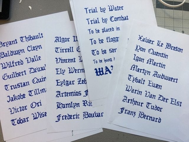
I also needed to come up with 30 names, which sounded right for that time, along with 30 crimes. Even though I could have easily used a Celtic style typeface, I decided I wanted to draw out all the words I was going to use in the posters. I felt this would give them a more organic, less uniform appearance and look ‘hand drawn’ as they would have been back then.
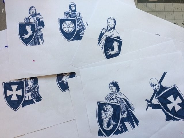
I applied the same principle when it came to drawing the portraits for these characters. I drew every one before scanning in all the drawn elements and placing them into Illustrator. I vectorized these drawings so they could be resized and arranged into the final wanted poster layouts. I decided to create the posters themselves in Illustrator so they could be reproduced at any time if there is any damage caused to them during game play.
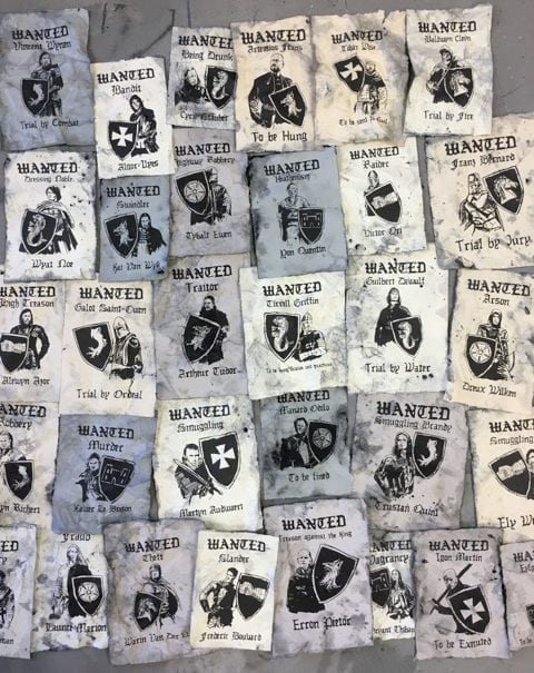
When printing the posters, I used a few different colors of card stock to add some variety. Part of the story I imagined was that these individuals would have been wanted for their crimes over many years. Therefore, wanted posters would be put up and left there as new wanted posters were layered on top. As a result, the posters would become aged, discolored, and weathered.
I resized the posters randomly so each of them would be a slightly different size. I ripped the edges and used aging techniques on the paper. I wet the paper to allow a mixture of black paint and water to naturally disperse over the surface and crumpled the paper so the paint would get caught in the creases. After adding more specks and darkening the edges of the page, they started to look the part. It was important not to go too dark or distress too much as the text and imagery still needs to be visible, so I think I struck a good balance while still giving them plenty of character!


